Analysing Socioeconomic and Health Factors K-Means Clustering Analysis
- Vusi Kubheka
- Nov 21, 2024
- 2 min read

In part one of our analysis, I used Principal Component Analysis (PCA) to reduce the dimensionality of a dataset detailing socioeconomic and health factors across various countries. By doing so, it transformed a multi-dimensional dataset into two principal components, simplifying our visualisation and subsequent clustering tasks.
In this second part, I apply K-Means clustering to group countries based on their socio-economic and health profiles. This approach allows us to identify patterns and recommend priority regions for aid allocation.
Step 9: Selecting the Number of Clusters Using the Elbow Method
To apply K-Means clustering, the first step is to determine the optimal number of clusters. This is achieved using the Elbow Method, which plots the Sum of Squared Errors (SSE) for different numbers of clusters (k). The "elbow" in this curve indicates the ideal value of k where adding more clusters yields diminishing returns in reducing SSE.
Here’s the code:
from sklearn.cluster import KMeans# KMeans parameterskmeans_kwargs = {"init": "random", "n_init": 10, "random_state": 1}k_values = range(1, 31)sse = []for k in k_values: kmeans = KMeans(n_clusters=k, **kmeans_kwargs) kmeans.fit(final_result) sse.append(kmeans.inertia_)# Plotting the Elbow Curvesns.lineplot(x=k_values, y=sse, marker='o')plt.xlabel('Number of Clusters')plt.ylabel('Inertia')plt.title('Elbow Curve')plt.savefig('Elbow_Curve.png')plt.show()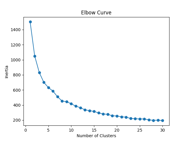
The Elbow Curve shows a significant drop in SSE initially, followed by a plateau. By visually inspecting the curve, we select k=3 as the optimal number of clusters.
Step 10: Fitting K-Means Clustering
Once the number of clusters is determined, we apply K-Means clustering to our two-component dataset. The algorithm groups the countries into three clusters based on similarities in their socio-economic and health factors.
kmeans = KMeans(n_clusters=3, **kmeans_kwargs)final_result_kmeans = kmeans.fit(final_result)The kmeans.labels_ attribute provides the cluster assignment for each country.
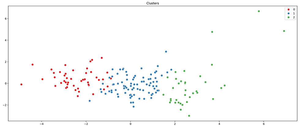
Step 11: Visualising Clusters
To understand the clusters better, we visualise them in the two-dimensional space defined by our principal components. Each country is plotted, coloured by its assigned cluster. Annotations indicate the specific countries in each cluster, making the insights actionable for decision-makers.
list_countries = list(data['country'])# Plotting clustersplt.figure(figsize=(20, 8), dpi=200)sns.scatterplot( x=final_result[:, 0], y=final_result[:, 1], s=60, hue=kmeans.labels_, palette='Set1')plt.title('Clusters')plt.xlabel('Component 1')plt.ylabel('Component 2')plt.axhline(y=0, ls='--', c='red')plt.axvline(x=0, ls='--', c='red')# Annotating countriesfor i in range(len(list_countries)): plt.annotate( list_countries[i], (final_result[i, 0], final_result[i, 1]), textcoords="offset points", xytext=(5, -5))plt.savefig('Clusters.png')plt.show()This scatterplot provides a clear visual representation of the clusters, with the countries grouped based on their socio-economic and health profiles. The annotations make it easy to pinpoint which cluster each country belongs to.
Insights and Recommendations
The clustering results reveal distinct groupings of countries, each representing a different socio-economic and health profile. These insights are invaluable for making data-driven decisions:
Cluster 1: May represent countries with critical needs, requiring immediate and extensive aid.
Cluster 2: Countries in this group could be moderately developed, needing targeted interventions to improve specific areas.
Cluster 3: Likely includes well-developed countries with minimal need for aid.
By analysing the characteristics of each cluster, we can suggest priority areas for aid allocation. For instance, focusing on Cluster 1 countries ensures that resources are directed to regions with the most pressing needs.

Comments